
As 2025 unfolds, web design is no longer just about visual appeal—it’s about speed, usability, and how well your site aligns with today’s digital behaviors. For Dallas businesses, staying on top of emerging trends is critical in a fast-moving, innovation-driven city. In this post, we’ll explore the top web design trends for 2025 and how Dallas-based brands can use them to boost visibility, improve user experience, and grow online.
1. Hyper-Personalized User Experiences
Modern consumers expect websites to feel custom-made. Using AI tools and behavioral analytics, websites can now:
Deliver tailored product or service recommendations
Display personalized content based on browsing history
Adjust layout based on user behavior
👉 For Dallas e-commerce stores or service-based businesses, this translates to higher engagement, stronger trust, and more conversions.
2. Voice Search Optimization & Conversational Interfaces
With voice assistants like Siri, Alexa, and Google Assistant now part of everyday life, voice search is on the rise. Your website must:
Use natural, conversational language in its content
Target long-tail keywords and questions
Feature smart chatbots and conversational UIs
🗣️ This trend can greatly improve customer support and SEO performance, especially for busy Dallas users seeking fast answers.
3. Mobile-First and Thumb-Friendly Design
With over 60% of web traffic coming from smartphones, mobile-first design isn’t optional—it’s essential. Dallas users are often on the go, so your site must:
Load quickly on all devices
Be easy to navigate with one hand
Use larger touch targets (buttons, links)
Present shorter, scannable content blocks
📱 Prioritizing mobile UX can reduce bounce rates and increase engagement.
4. Eco-Friendly and Sustainable Web Design
Today’s users—especially Millennials and Gen Z—care about sustainability. A fast, lightweight site that uses minimal server resources is not only better for performance but also better for the environment.
Tips for eco-conscious design:
Minimize use of heavy scripts and large media files
Use clean, minimalist layouts
Highlight your brand’s sustainability practices
🌱 Dallas businesses that align with these values can build deeper trust with socially conscious audiences.
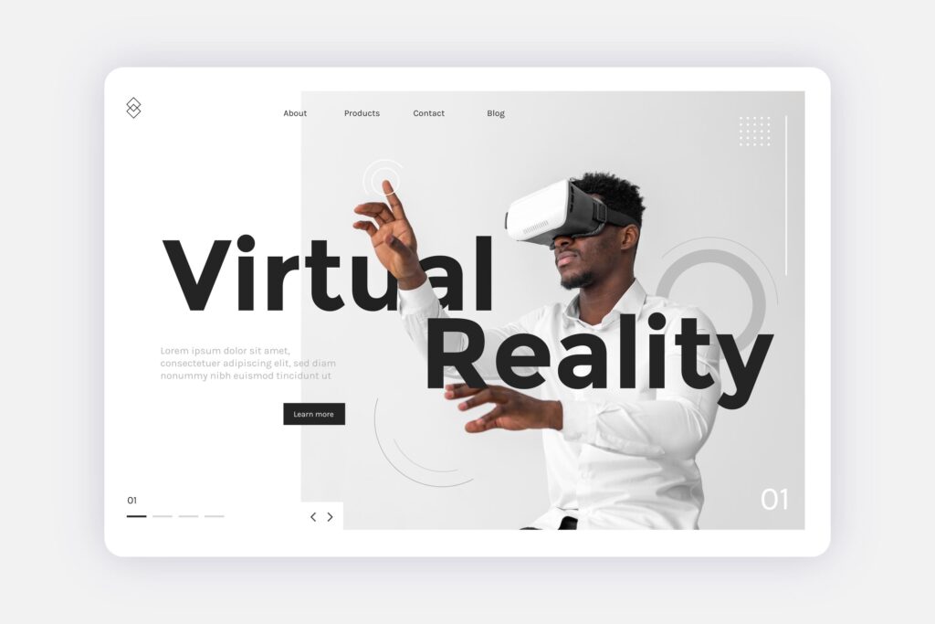
5. Interactive and Immersive Experiences
Modern web design is becoming more interactive and engaging. Instead of passive browsing, users now expect:
Scroll-triggered animations
Hover effects and micro-interactions
Clickable product demos or tutorials
Immersive visual storytelling
🎮 For brands in Dallas’s creative, tech, or competitive markets, adding these elements can create more memorable user journeys.
6. Dark Mode and Inclusive Accessibility
Accessibility is a must in 2025—not just for compliance, but because users expect it. Offering:
Dark mode toggle
Scalable fonts
Keyboard navigation
Screen reader support
…makes your site usable for everyone.
🌐 Accessibility improves SEO, increases reach, and shows that your Dallas business values inclusivity.
7. Localized Design and Dallas-Centric Content
People connect with brands that feel familiar. Using local imagery, regional references, and community-focused messaging helps you:
Build stronger brand loyalty
Improve local SEO rankings
Stand out in the Dallas market
🏙️ Consider showcasing Dallas landmarks, featuring testimonials from local clients, or even adding a “Proudly Serving Dallas” statement.
Final Thoughts
Web design in 2025 is about creating smarter, faster, and more human-centered websites. For businesses in Dallas, staying ahead of these trends is not just about keeping up—it’s about standing out.
🚀 Ready to refresh your website?
📞 Contact FemStudio today and let’s build a website that grows with your business.

Today, having a website isn’t enough — your site needs to work everywhere. At FemStudio, we’ve helped many Dallas-based businesses improve their websites by focusing on one crucial thing: responsive web design.
Think about it: most of your customers are browsing on their phones. If your website doesn’t look good or function well on mobile, you’re likely losing visitors — and sales.
What Is Responsive Web Design?
Responsive web design means your website adjusts automatically to fit different screen sizes — smartphones, tablets, laptops, and desktops. It offers a seamless experience no matter how someone finds your site.
For example, one of our clients, Ruth — an event planner in Dallas — came to us with a site that looked great on desktop but completely broke on mobile. She was losing potential customers who clicked from Instagram but couldn’t even read her service list. Once we redesigned it responsively, her engagement and bookings improved significantly.
Why Dallas Businesses Need a Responsive Website
1. Mobile Traffic Is King in Dallas
People in Dallas are always on the go — from Uptown cafes to downtown co-working spaces. That means your website must deliver a great mobile experience. A responsive design makes sure your message gets across clearly, no matter where or how people are browsing.
2. Better SEO Performance
Google ranks mobile-friendly websites higher. Responsive web design improves your SEO, increases page speed, reduces bounce rates, and helps your business show up in “near me” searches — like web design Dallas or Dallas photographers.
Want to rank higher? Start with a site that performs well on all devices.
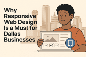
Illustration showing how responsive web design adapts across all devices—a must for Dallas businesses.
3. Increased Conversions and Leads
Let’s be real — a clunky mobile site turns people away. A smooth, responsive design keeps users on your page longer, guides them to take action, and helps you convert more visitors into leads and customers.
4. It Saves You Money Over Time
Responsive web design is efficient. Instead of creating separate mobile and desktop versions, you have one website that works everywhere. Fewer headaches, lower maintenance costs, and better return on investment.
How FemStudio Helps Dallas Businesses Shine Online
At FemStudio, we specialize in building responsive websites that not only look amazing but also work flawlessly across all devices. From web design and SEO services to stunning photography, our digital solutions help Dallas businesses grow online.
Whether you’re a startup, a solo creator, or a growing brand, our team tailors each site to your goals — so your website becomes a real business tool, not just a digital placeholder.
Final Thoughts
If you’re a Dallas business owner, investing in responsive web design is no longer optional — it’s essential. Your customers are online, on mobile, and expect a great experience. Let’s make sure your website delivers it.
Ready to upgrade? Contact FemStudio today and let’s build a site that grows with your business.s
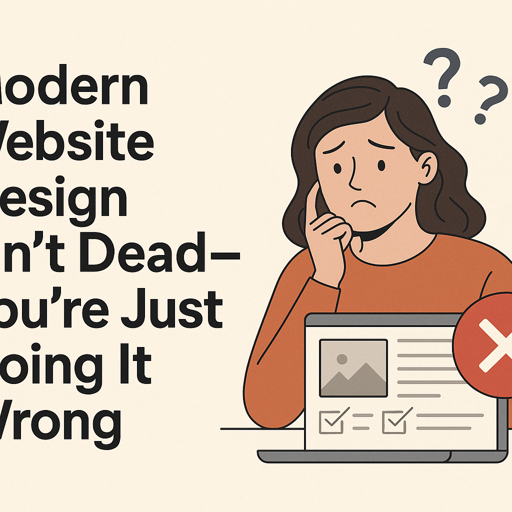
Let’s be real — your website might look okay, but is it actually doing anything? Maybe it’s been months since someone filled out your contact form, or your bounce rate is through the roof. That doesn’t mean your business is failing — it means your site might need a reality check.
At FemStudio, we talk to clients who feel stuck all the time. They say things like,
“We launched our site two years ago, but it just doesn’t bring in leads.”
Or,
“People visit but never reach out.”
Here’s the thing: modern website design is less about flashy graphics and more about user behavior, responsiveness, and genuine connection. Let’s explore how you might be getting it wrong — and how to fix it.
1. You’re Still Using a 2010 Template
If your site still has drop shadows, cramped text, and ten different fonts, it’s time for a redesign. We once helped a retail client who couldn’t understand why their online sales were dropping. Turned out, their homepage still looked like a PowerPoint slide from 2012. After a redesign, their conversion rate jumped 35%.
👉 Practical Fix: Use clean layouts, consistent fonts, and whitespace. Less clutter, more clarity.
2. People Don’t Know What to Do Next
Imagine walking into a store and not knowing where to go. That’s what happens when your site lacks a clear call-to-action (CTA). A client came to us with a beautiful homepage — but no buttons, no guidance. Users scrolled and left.
👉 Practical Fix: Add action prompts like “Book a Free Call” or “Start Shopping.” Guide people with purpose.
3. Your Website Doesn’t Work on Phones
It’s 2025 — people are browsing while commuting, cooking, or waiting for their kids. If your site pinches, zooms, or loads weirdly on mobile, you’re losing half your audience. One of our clients, a fitness coach, didn’t realize her mobile visitors were leaving because her signup form only worked on desktop.
👉 Practical Fix: Test your site on multiple phones. Better yet, use responsive design.
4. You’re Not Using Visuals That Matter
Stock photos of handshakes won’t cut it anymore. One client we worked with swapped their generic images for real team photos and project shots. Engagement doubled in a week.
👉 Practical Fix: Use professional photography (like we offer 😉), behind-the-scenes shots, or product demos. Real sells.
5. Your Site Loads Slower Than a Monday Morning
Speed affects everything — user experience, SEO, bounce rate. A bakery we worked with had a homepage filled with high-res images that took ages to load. Customers bounced before they ever saw the cake.
👉 Practical Fix: Compress images, use caching, and check your performance using Web.dev.
6. You’re Not Speaking to Your Audience
Modern design starts with modern copy. Are you writing like a robot or like someone who gets their customer? People connect to brands that sound human.
👉 Practical Fix: Use natural language. Talk like you’d talk in person — with clarity, warmth, and intent.
Conclusion:
You don’t need a new website just to look trendy. But if yours isn’t reflecting your brand, connecting with visitors, or working on mobile, it’s time for a refresh.
Modern website design is about clarity, function, speed, and trust. Get those right, and you’ll start seeing real results — leads, clicks, sales, and loyal customers.
Call to Action:
Ready to modernize your site? Explore our web design services at FemStudio or test your site performance with Google’s Web.dev. We’re here to help you level up — without the stress.